The data:
1901-1910 13.59
1911-1920 13.64
1921-1930 13.76
1931-1940 13.89
1941-1950 13.95
1951-1960 13.92
1961-1970 13.93
1971-1980 13.95
1981-1990 14.12
1991-2000 14.26
2001-2010 14.47
How the data appears in a bar graph if plotted with the Y-axis starting at 13.4:
How the data appears in a bar graph if plotted with the Y-axis starting at 0.
And now with a normal, unbroken Y axis that starts at zero:
Using a scale that ranges from -10% to +10%
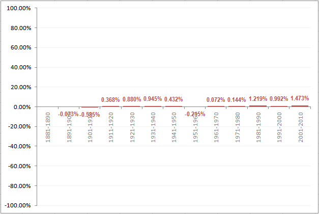
Using a scale that ranges from -100% to +100%:
Decade Global temperate in °C
1881-1890 13.68
1891-1900 13.67 1881-1890 13.68
1901-1910 13.59
1911-1920 13.64
1921-1930 13.76
1931-1940 13.89
1941-1950 13.95
1951-1960 13.92
1961-1970 13.93
1971-1980 13.95
1981-1990 14.12
1991-2000 14.26
2001-2010 14.47
How the data appears in a bar graph if plotted with the Y-axis starting at 13.4:
How the data appears in a bar graph if plotted with the Y-axis starting at 0.
For time-series data I think the line graph is much better suited as a
data visualization. The same data if plotted as a line graph:
First, with the Y-axis starting at 13.4:
When you resort to such gimmickry to buttress your point, it not only hurts your credibility but also harms the cause.
Update: what if we decide to plot the inter-decade differences in
temperatures as a percentage difference? Would that make a difference?
Perhaps, but here again, the choice of scale you use makes a huge
difference in perception.
Using a scale to maximize differences.
Using a scale that ranges from -10% to +10%
Using a scale that ranges from -100% to +100%:


No comments:
Post a Comment